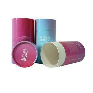
The seven most difficult colors to print of paper packaging
The seven most difficult colors to print of paper packaging
A variety of colors can be used in product design, but not all colors can be printed well in actual printing, according to the actual experience of many people, here’s a quick summary of what colors are the most difficult to print paper boxes
1,4-color screen and 3-color screen, full color do not print (it is recommended to use spot color printing paper packaging )
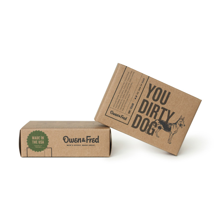
2, a large area of neutral Brown, easy printing. Print out the color is ugly
3, large areas of dark green. It’s also easy to print, and the hardest thing to print is something designed by someone who doesn’t know how to print. Color is on the one hand, too many multi-color lines thin, extremely small white and so on.
4, C = 50m = 50y = 50k = 50k = 50 Daping Net, a little bit of inaccuracy on the serious color deviation.
5, there is also a black substrate is not easy to deal with. Black background in order to achieve the effect can be printed with special black ink or twice, it is not difficult to print, just labor.
6, album printing in general full version of things, spot color full version or a larger area, anti-white words, the same Logo, and the same color block, it is generally difficult to follow the color, color difference.
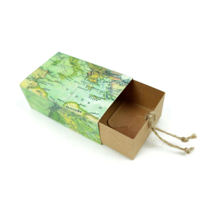
7. The Blues and Greens are not easy to grasp when printed together.
