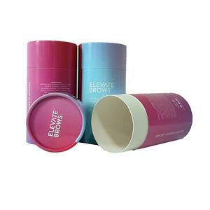
Is It Important To Print In Color Box Packaging?
Is It Important To Print In Color Box Packaging?
paper pack box
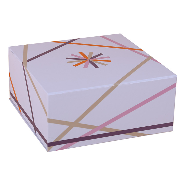
The color design of the color box packaging is attached to the graphics, words and muscles. It not only requires beauty and generosity to meet people's aesthetic requirements, but also should be highly coordinated with people's psychological feelings. Printing technology. The color design of color printing for color box packaging mainly considers the printing market from the following aspects.
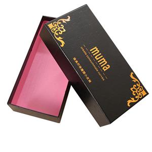
paper folding box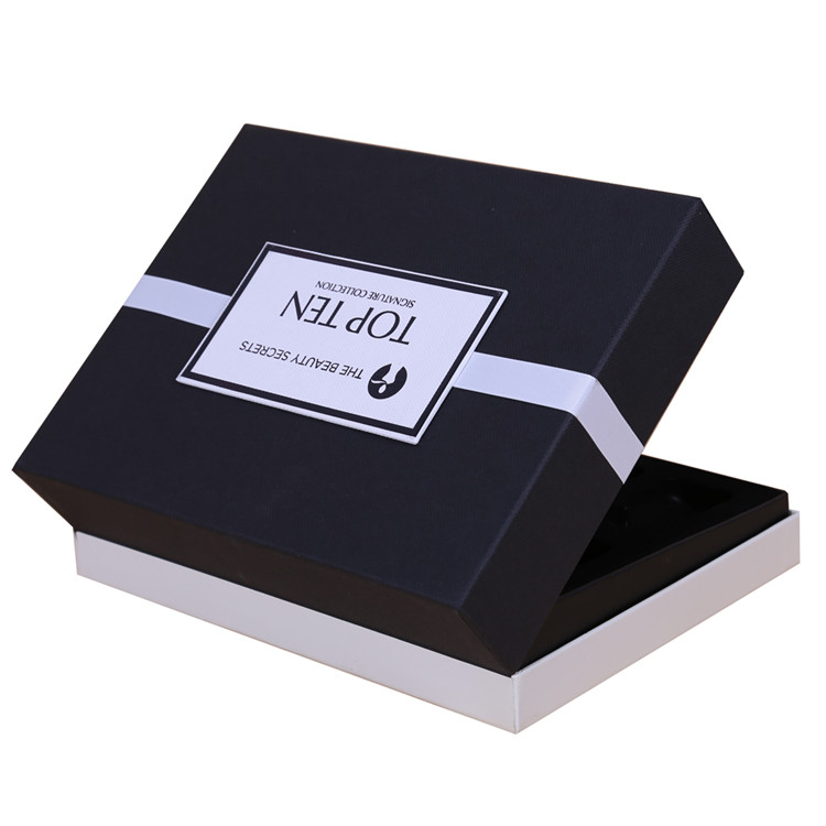
Hue is the overall tendency and mood of the color configuration on the screen. It is the main color of a group of colors and it is the absolute dominant printing technology in the whole screen. Packaging is required to stand out from the moment on the long-distance shelves to visually convey product information. This requires a strong overall color tone to match the printing market. Therefore, the key to the color of color box packaging design is the color design equipment consumables. The color design requirements are consistent with the main functions of the product, such as red tones for gift packaging, and cold tones printing for cold beverage packaging. The color design requirements are consistent with the times and the preferences of different regions and different nationalities for color. They must be able to adapt to this change and conform to the trend of the times. For example, people in the Islamic area prefer green to yellow, and Tibetans avoid white as the noble color. Use light yellow and green; Manchu people like yellow, purple, red, blue and avoid white and other materials. Tonal design should fully consider these traditional habits in order to make products welcome. For export products, packaging design can only respect the custom printing market of other countries or nationalities.
shoe paper box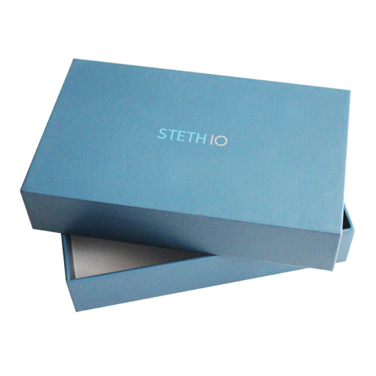
On the twelve hue ring, the two similar colors are called tonal color printing tools. The color harmony gives people an implicit, rich, elegant, pleasant and comfortable feeling. The main reconciliation methods are: the same color tone refers to the color matching with the same color and different brightness, such as light green, bright green, dark green, or light red, red, and dark red. The approximate hue sum refers to the combination of different colors containing common components, such as orange, vermilion, and yellow, which contain yellow components. It is easy to coordinate printing technology when they are combined together.
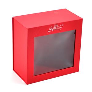
paper box with pvc window
