Color Box Packaging Should Be More Beautiful In Function, And Unveil The Mystery Of Color Design
Color Box Packaging Should Be More Beautiful In Function, And Unveil The Mystery Of Color Design
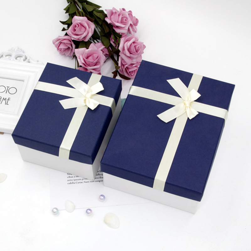
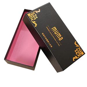
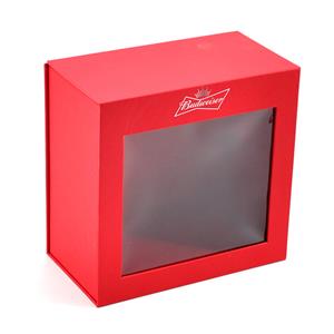
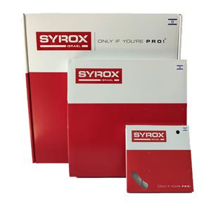
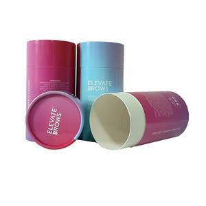
Color box packaging is the clothing of a product. With it, consumers can not only see the information they want to know, but also because of the unique design and packaging of the product, they can confirm their choice! Today, consumers love something different, new and unique. For carton color box packaging customization is no exception, so the term "gift box packaging customization" appears.
white cardboard boxes
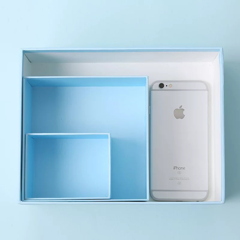
When it comes to gift box packaging customization, in fact, it must follow the color design skills in customization, because color matching is the key to consumers' overall perception of the product. So, how to make a color match to design a color box packaging that matches your product?
cheap packing boxes
 I. Contrast
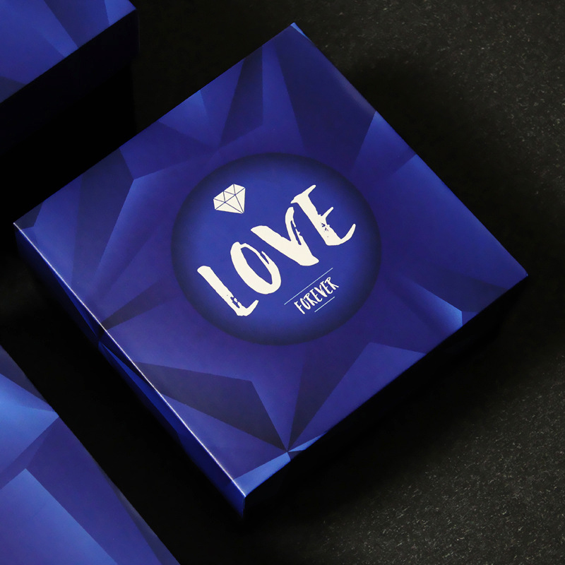
The use of contrasting colors in gift box packaging customization is the most frequent and most widely used method in packaging design. It is usually used as a large area of light-colored base, and the dark-colored composition is used on it. For example: Use a pale green floor, and use pale yellow or white pattern lines. The visual effects it shows are bright, simple, gentle and elegant.
custom packaging boxes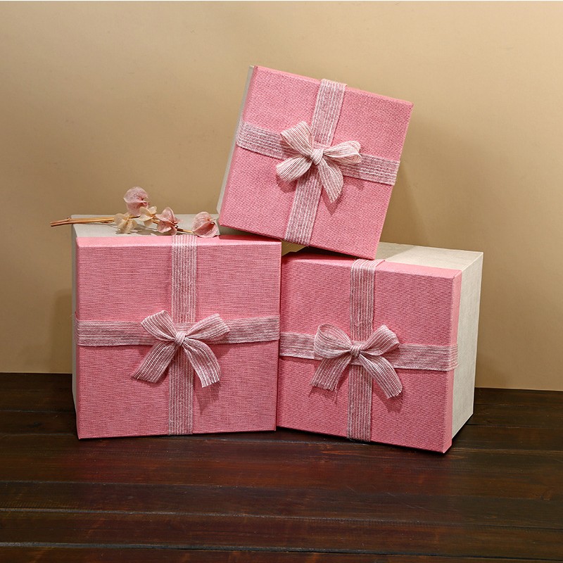
Second, light and heavy contrast
This point should be distinguished from the contrast mode of light and shade. This kind of contrast is often a light and deep theme pattern set against a light and simple background, or a light and elegant package in the light and deep theme pattern Subject and name, as well as a trademark or slogan. In this light and heavy contrast, the pigment usually has a coordinated color contrast and a warm and cold color contrast method.
boxes and packaging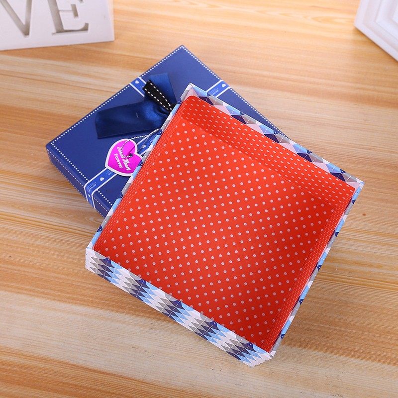
Point-to-face ratio
Point-to-face ratio is also called size contrast. This kind of contrast is mainly used in the design of a packaging picture, using the contrast from a center or concentration point to the overall picture on the pigment, that is, the contrast between the small and large range pictures. In addition to the above three points, there are simple and simple contrasts in color use, elegant contrasts, contrast contrasts, and so on.
